From grey…
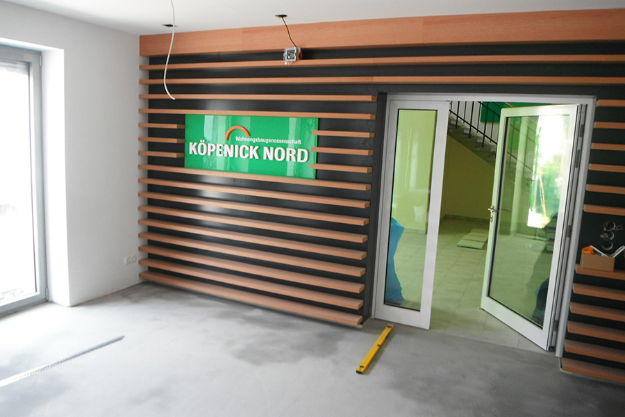
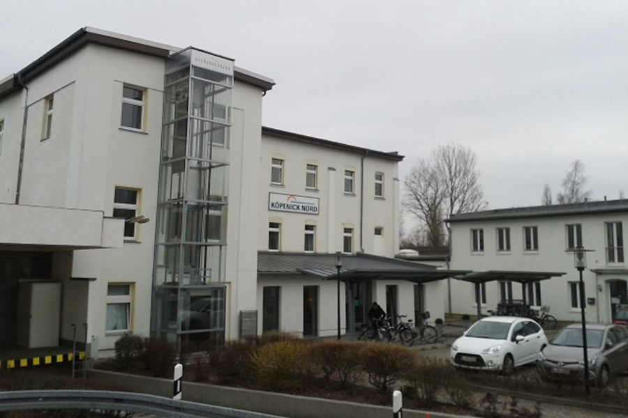
Köpenick Nord offers flats in Berlin’s greenest borough, amidst parks, lakes and forests. All this close to the centre. Yet, when looking at the company’s image, everything was grey, dark and not inviting. Even the logo used an almost blackish green. Photo: Koepenick Nord’s headquarters before Extractdesign
… to spring!
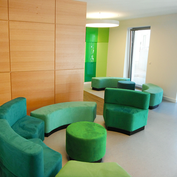
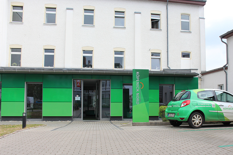
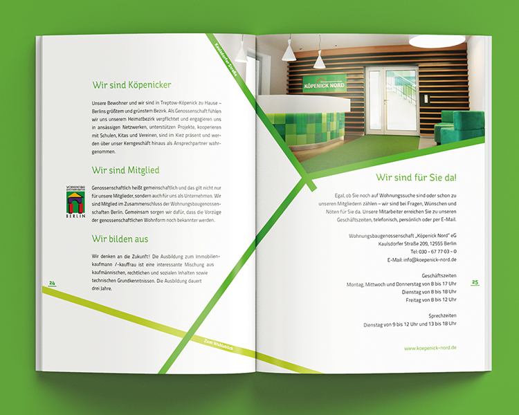
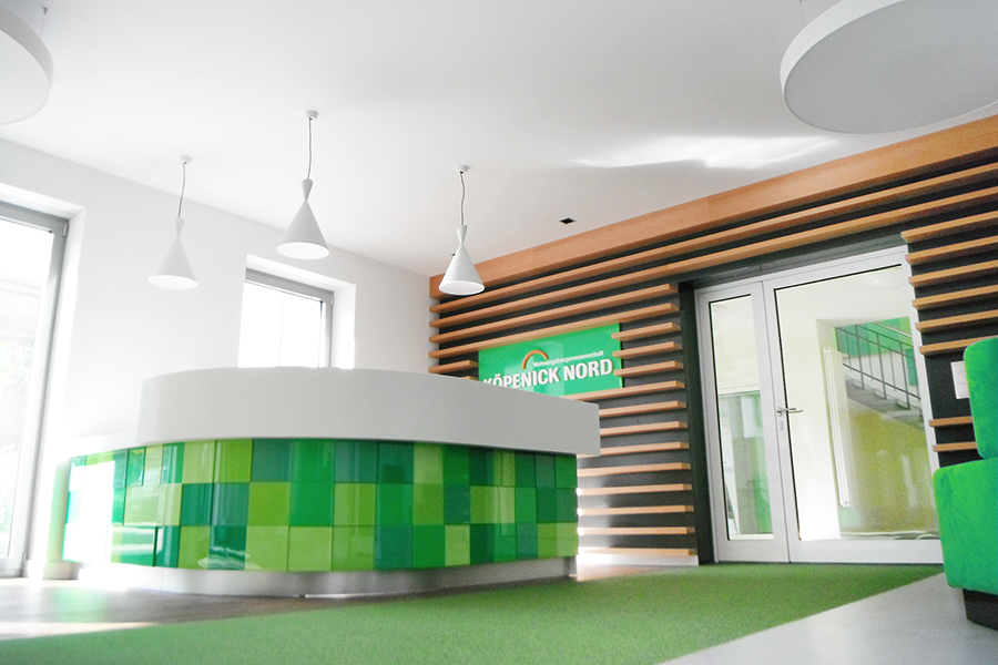
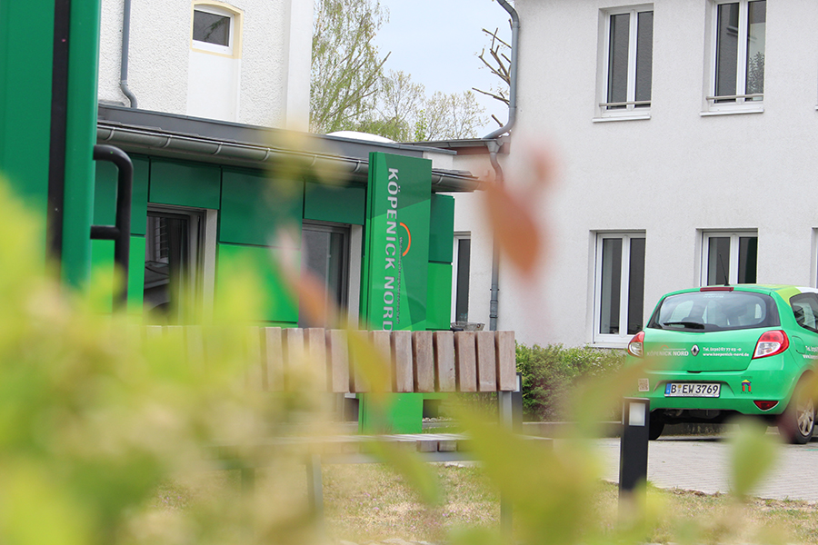
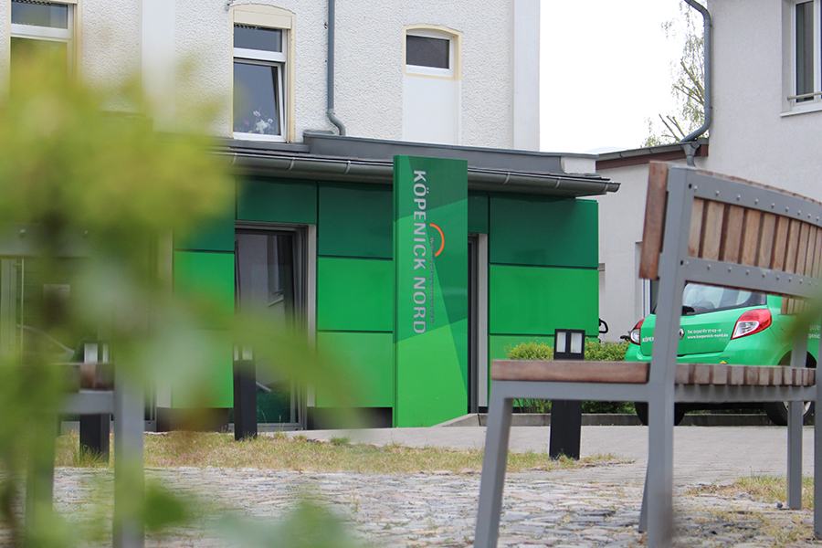
Extractdesign completely and calmly re-designed Köpenick Nord. During an initial phase we introduced more inviting spring green colours. We started to use the long name in a shortened brand style, also being more human. Extractdesign refreshed the entrance area with new design, furniture and functions. We erased half of the parking lot and substituted it for a green seating area. The buildings front wall became a clear green focal point.
As welcoming as home.
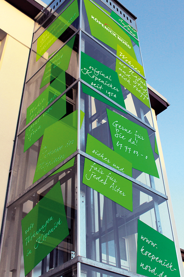
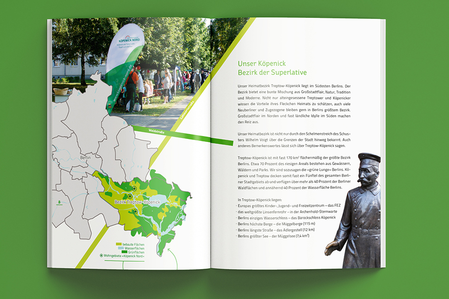
At the end of the work, everything looks just inviting, fresh, flowerisch. From design to architecture, from advertising to brand slogan – everything is matching to Köpenick Nord’s image and client target group. Unique ideas round up everything: a wall covered with personal green sticky notes, an image brochure with the company’s streets driving through it, or 3-floor high stickers on a glass elevator.
Done by Extractdesign: Logo redesign, company slogan, car fleet, interior architecture, corporate design, exterior architecture, signage, brochures, modular furniture in company’s logo shape, event design, merchandising, advertising, annual reports, image brochures, flyers, sub-brands, real-estate brands.
